Go Back Go Back
 Print Page Print Page
Projector Hue and Eye - The Perception of Color
Source: Da-Lite: Angles Of View
When we look at imagery projected onto a display screen, the pattern recognition activity undertaken by our eyes and our brain is multifarious and complex. In addition to discerning between lines and contours, darks and light, our visual system relies heavily on its ability to distinguish between what our brains call colors. Because these days every projector is certain to be a color projector, let's see what it takes to display an image in color and let's see what we see when we see.
Before undertaking a closer look at color, let's take a sideways glance at black-and-white. If that classic pair is restricted to just those two extremes, we are contemplating a display that is just like this text. Even though the content and context of the words presented may be as complicated as we wish to imagine, the resources necessary to display them are not extensive. To "write" either all of this page or all of this screen, it is only necessary to instruct each of the pixels beneath to be either ON or OFF.
Next let's suppose that the "page" is actually a "frame" snipped out of a black-and-white movie. To "write" this one, the pixels are going to need more elaborate instructions which are no longer binary . What a moment ago was black or white has now become black, white, or some admixture of the two which we call gray. The number of gradations our display permits between its two extremes is what is called its grayscale.
Obviously a large grayscale permits greater subtlety of shading and texture than a small one. And whereas, we may not need much grayscale comfortably to read this text, we will appreciate it greatly if we are, for example, contemplating a photograph of Abraham Lincoln or a drawing by Rembrandt.
Grayscale, or the perception of the degrees of lightness and darkness of an object or a scene, is the first of three concepts we'll need thoroughly to examine color. The second two are called Saturation and Hue.
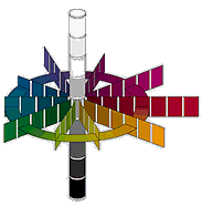
The above image is an abstract diagram which plots the three "properties" of color in something called Munsell color space.
The axle around which the color wheel spins is the grayscale (sometimes called "value"). Each spoke represents a different color with a shift in hue progressing clockwise from red (the longest arm at the "3 o'clock" position) through orange to green to blue to purple and back to red. The Saturation (sometimes called "chroma") of each hue increases along each radial spoke as it extends away from the central axle.
It is important to note that it is neither accidental nor arbitrary that color space is defined as possessing three dimensions: Lightness, Hue, and Saturation. It is our eyes themselves which impose this expectation and unless we have all three we are in some sense "color blind."
At the center of the human retina is a dense cluster of photoreceptors called cones. Unlike the rods which govern the peripheries of our vision and which can only "see" in black-and-white, the mosaic of cones is divided into three separate types, each of which is sensitive to a different (but overlapping) range of colors. It can be no surprise that the central or primary color in each range is Red, Green, and Blue.
Theoretically any color we chose can be matched by some mixture of three primary colors. (Interestingly, the converse is not true.) Many colors can be matched using just two primaries, but not all. An especially interesting attribute of color which transcends its three dimensions, is whether it belongs to an object in the real world or to a representation of that object which we call its image.
When we watch a fire engine blaring down a road, our brains decipher that the object is red because the paint coating the sides of the vehicle has been constituted so that it absorbs the blue and green parts of the sunlight illuminating it. Thus only the light with the proper "red" wavelength is left to be reflected back for interpretation by our eyes and brains. If none of the light were to be absorbed, the fire engine would appear white. If all of the light were to be absorbed it would appear black. If we try to see it at night, it will appear gray because our night vision (the rods) is sensitive to grayscale much more than it is to either Saturation or Hue.
Now what about an image of that fire-engine, projected by a video projector and displayed upon a screen? Clearly we are no longer viewing in sunlight but have turned to look at Da-Lite. The fire engine, of course, is no longer there, but its image is and the image is red. It's most probably not the same exact red (spectrally) as the one we saw in the street, but it's a pretty close red nonetheless.
This kind of "object" is what is called self-luminous. The red color is projected at our eyes and if we want to change it to orange we don't subtract color (via absorption) we add it.
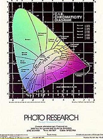
Looking at this phenomenon in a little greater detail, we can now see why all of our electronic projectors have, one way or another, three separate color sources, R, G, and B. These are the additive primaries. How they can be mixed together is demonstrated by the above diagram which was first constructed in 1931 by an organization known as Commission Internationale de L'Eclairage (International Commission for Illumination) or CIE.
Since it was already assumed that the human eye required three color stimuli for the perception of any color, the CIE decided to create a two dimensional representation of "color space" by creating a roughly triangular "chromaticity" diagram whose vertices were plotted according to the wavelengths of the three primaries.
At the curved top of the "triangle" is Green, at the bottom right is Red and at the lower left is Blue. At the center of the diagram is white. There is no black because in a self-luminous display black is created by the absence of light (and therefore color).
Note that any point within the diagram can be precisely specified by its X,Y coordinates which can then be used to inform a pixel what color it's supposed to be.
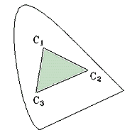
As a practical matter, when it comes to establishing the values of the primary R, G, and B light sources a smaller triangle is delineated within the CIE diagram so that adequate brightness can be achieved, even at the price of somewhat limiting the available colors. Figure 3 illustrates this and shows that only colors having coordinates within the inner triangle formed by connecting C1, C2, and C3 can be projected. (This circumscribed color space is called the system's "gamut.") Brown, for instance, is color you don't often see in an A/V image.
These limitations aside, how many colors can we expect to get out of our three sources and into an image?
The answer requires just a little arithmetic and begins with the black-and-white image that began this article. If the "color space" of an image is only black or white, it is said to be a 1-bit display. This means that each pixel only requires 1 bit of information to get its black or white color instruction.
If it's a black-and-white photograph, the color depth (grayscale) increases to 8 bits. This expansion is not linear, however, and the number of realizable shades jumps from 2 (expressed as 21) to 256 which is the product of 2 raised to the eighth power (28 = 256). What happens when we have three, 8-bit color sources, each with 256 available shades bracketing its primary color? The answer is 256 x 256 x 256 = 16,777,216 (224) which generally gets rounded in conversation to sixteen million.
Since the range of specific wavelengths to which the human eye is sensitive is actually quite limited (400 to 750 nanometers), it is truly remarkable that our visual systems can effortlessly process a spectrum of 224 (or more!) colors. And when we recognize that the information received by our brains and telling us that a fire engine is red is not in fact optical information, but electrochemical information, we are looking at an intriguing paradox. Since light of no wavelength reaches the brain, color, as we know it, is only an abstraction.
"Color is a sensation that light produces in the mind."
The principal sources used in the research of this article are: Judd, Deane B. and Wyszecki, Gunter, Color in Business, Science and Industry, John Wiley & Sons, New York, 1975.
Minnaert, M.G.J., Light and Color in the Outdoors, Springer- Verlag, New York, 1992
Perkowitz, Sidney, Empire of Light, Henry Holt and Company, Inc., 1996. The closing quotation is taken from Page 21.
Sobel, Michael I., Light, The University of Chicago Press, 1987.
Wandell, Brian A., Foundations of Vision, Sinauer Associates, Inc., Massachusetts, 1995.
|